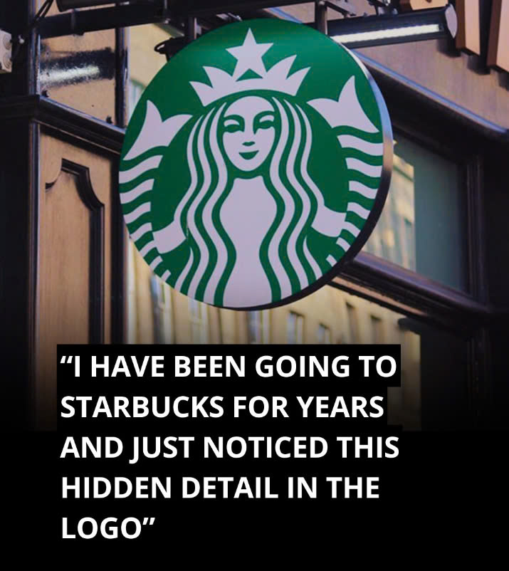
The Starbucks logo is one of the most iconic symbols in the world, greeting coffee lovers around the globe every day. But did you know that there’s a hidden detail within this familiar emblem that many people overlook? While the Siren in the logo seems perfectly symmetrical at first glance, a closer look reveals an interesting imperfection. Let’s dive into the story behind this hidden feature and what makes it so unique.

The Evolution of the Starbucks Logo
The Starbucks logo has gone through several changes since the company was founded in 1971. Initially, it featured a brown design with a double-tailed mermaid, known as a Siren, inspired by nautical themes and Herman Melville’s novel Moby-Dick. The Siren was meant to evoke the seductive allure of the sea, much like the lure of a good cup of coffee. In 1987, the company switched to the now-familiar green color as part of its rebranding. By 1992, the logo was further modernized when Starbucks became a publicly traded company, refining the Siren’s appearance.
The most significant change came in 2011 when Starbucks decided to remove the words “Starbucks Coffee” from the logo entirely. The new design made the Siren’s face the central focus, allowing the brand to stand on its own without the need for text. This shift was part of a broader strategy to expand beyond coffee and enter new markets, making the Siren emblem versatile enough to represent a wider array of products, from teas to snacks and even wine.
The Symbolism of the Siren
The Siren was chosen for more than just aesthetic reasons—it symbolizes the alluring nature of coffee, meant to draw people in just as mythological Sirens lured sailors. However, as Starbucks’ ambitions grew, so did the need for the Siren to evolve. The logo had to reflect not just the appeal of coffee but also a broader sense of warmth and approachability, aligning with the company’s expanding offerings.
The Imperfection in the Design
When Starbucks enlisted global branding agency Lippincott to redesign the logo in 2011, the goal was to make the Siren appear confident, inviting, and approachable. Initially, the design team created a perfectly symmetrical version of the Siren’s face. However, they quickly realized something was off. “She was uncannily beautiful, a bit creepy, to be honest,” said creative director Connie Birdsall. The flawless symmetry made the Siren seem too robotic and distant.
To fix this, the team decided to add a slight imperfection to make the Siren appear more relatable and human. Birdsall explained that this subtle change was essential to the logo’s success. By introducing an asymmetry, they added a touch of humanity to the Siren, making her more appealing to customers.
The Hidden Asymmetry in the Logo
If you examine the Siren’s face closely, you’ll notice that it isn’t perfectly symmetrical. The right side of her face is slightly different—there’s more shading, and her nose dips a bit lower on that side. While these differences are subtle, they make the Siren feel less like a flawless mask and more like a warm, relatable figure.
As design partner Bogdan Geana put it, “It felt a bit more human and less like a perfectly cut mask” after adding the asymmetry. This small but impactful detail transformed the Siren from a distant, idealized figure into a symbol that millions of coffee lovers worldwide could connect with.
Why Asymmetry Works
The decision to make the Siren’s face asymmetrical goes against the traditional belief that beauty lies in symmetry. However, the Starbucks design team recognized that too much perfection could make the logo appear cold and unapproachable. By adding a slight imperfection, they created a friendlier, more welcoming brand image. This design choice allowed customers to feel a deeper connection with Starbucks, making the Siren not just a logo, but a symbol of humanity.
The Siren’s Role Beyond Coffee
Another notable change in the 2011 redesign was the removal of the words “Starbucks Coffee.” By that time, the Siren was so well-known that the company no longer needed text to communicate its brand. This allowed Starbucks to expand its identity beyond just coffee, as the Siren became a universal symbol for the company’s broader range of offerings. Today, Starbucks serves everything from breakfast sandwiches to wine, with the Siren representing it all.
The Subtlety Behind the Starbucks Logo
Next time you hold a cup of Starbucks coffee, take a closer look at the Siren’s face. The hidden asymmetry serves as a reminder that perfection isn’t always the most relatable quality. This subtle detail isn’t just a clever design element—it’s a reflection of the thoughtful branding that has made Starbucks a global success.
The Starbucks logo stands as a testament to the power of design, showing that a small imperfection can make a big impact. It makes the Siren feel more human, more approachable, and ultimately more effective as a symbol of the brand.


