Every day, we come across logos on billboards, websites, and product packaging, yet many of them hold deeper meanings than what initially meets the eye. While some logos are designed to be straightforward, others contain hidden elements, subtle messages, or symbols that tell a story. These intricate details often go unnoticed but play a significant role in making a brand memorable. Let’s take a closer look at the fascinating hidden stories behind some of the world’s most recognizable logos.

1. Tesla: More Than Just a “T”
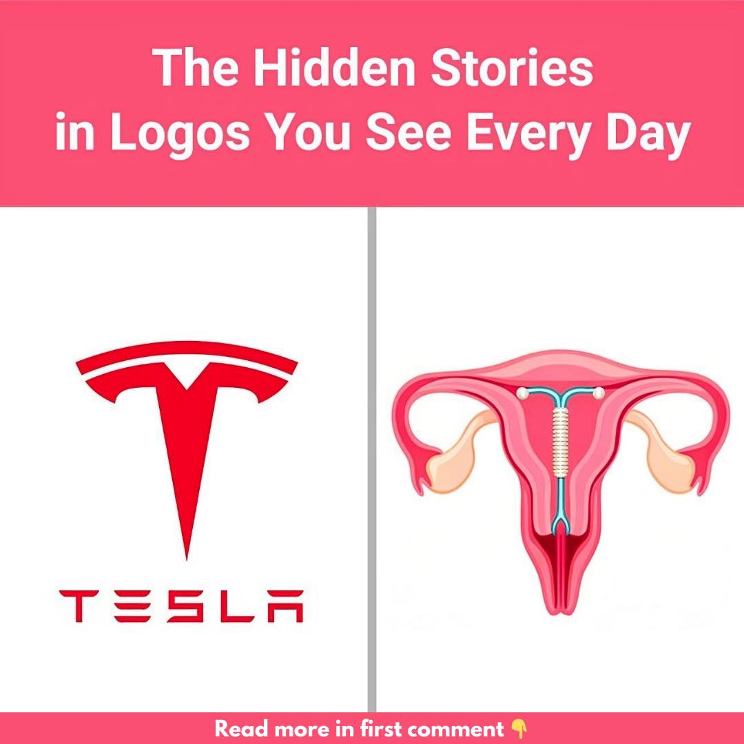
Tesla’s logo might seem like a simple, modern “T” representing the brand name, but it has layers of meaning. Some people see the logo as resembling a cat’s nose or even an IUD due to its shape. However, the most widely accepted interpretation is that the Tesla “T” represents a cross-section of an electric motor, perfectly aligning with the company’s focus on electric vehicles. This clever design pays homage to the engineering and innovation behind the brand’s cutting-edge technology.
2. Uncle Ben’s: A Friendly and Familiar Face
Uncle Ben’s, a household name for rice products, has a smiling, friendly older gentleman on its packaging. The face belongs to Frank Brown, a maître d’hôtel in Chicago whom the founders met in the 1940s. His warm demeanor left such an impression on them that they decided to feature his likeness on the packaging. This decision created a brand that not only represents quality rice but also evokes trust and warmth in every box.
3. Amazon: A Smile with a Hidden Message
At first glance, Amazon’s logo looks like a simple smile. The arrow extending from “A” to “Z” not only forms a smile but also subtly hints that Amazon offers a vast selection of products—from A to Z. This clever, minimalist design symbolizes the company’s commitment to customer satisfaction and their goal of providing everything under the sun. It’s a perfect example of a logo that says a lot with just a few elements.
4. Hershey’s Kisses: A Sweet Hidden Detail
The Hershey’s Kisses logo has a playful hidden surprise that many people miss. If you look closely between the “K” and the “I” in “Kisses,” you’ll see a tiny Hershey’s Kiss nestled in the negative space. This small, hidden element adds a touch of whimsy and reinforces the sweet, charming nature of the brand’s iconic chocolates.
5. Quiksilver: Inspired by a Famous Wave
Quiksilver, a brand known for its surfwear, features a logo with a wave and a mountain. This design is inspired by the famous Japanese woodblock print, The Great Wave off Kanagawa, by Hokusai. The logo not only captures the adventurous spirit of surfing but also connects the brand to nature, making it a perfect fit for outdoor enthusiasts who seek adventure.
6. Versace: The Enchanting Power of Medusa
Versace’s logo features Medusa, a figure from Greek mythology who had the power to enchant anyone who looked at her. Gianni Versace chose Medusa as the brand’s symbol to evoke a sense of allure, beauty, and danger in his designs. The idea is that those who see the logo—and the clothing—will be drawn to it, just as people were mesmerized by Medusa’s gaze.
7. Disney: A Magical Castle with Real-Life Inspiration
Disney’s iconic castle logo is synonymous with fairy tales and childhood wonder. What many people don’t know is that the castle is based on the Neuschwanstein Castle in Germany, a romantic, whimsical structure commissioned by King Ludwig II. This connection to real-world architecture adds another layer of magic to the logo, tying Disney’s animated worlds to a real-life fairy tale.
8. The Laughing Cow: A Clever Design Trick
The Laughing Cow logo is more than just a smiling cow—it uses a clever design technique known as the Droste effect. The cow wears cheese box earrings that display a smaller version of the logo, creating an image within an image. This playful touch not only makes the logo memorable but also reflects the fun and lighthearted personality of the brand.
9. NASA’s “Meatball” Logo: A Tribute to Space
NASA’s “meatball” logo was designed in 1959 and is packed with symbolism. The blue circle represents Earth, the stars symbolize outer space, and the red chevron is a nod to aeronautics, representing a wing. The spacecraft orbiting the circle highlights NASA’s mission of space exploration, making this logo a compact summary of the agency’s goals and history.
10. LUKOIL: A Tribute to Its Roots
LUKOIL, one of Russia’s largest oil companies, derives its name from the initials of three oil-producing cities: Langepas, Uray, and Kogalym. By embedding these cities into its name, LUKOIL subtly pays tribute to the regions that are essential to its success. It’s a clever way to honor the company’s roots while creating a memorable brand name.
Conclusion: Uncovering the Secrets in Logos
Logos are more than just symbols—they tell stories, convey values, and represent a brand’s vision. Each of these logos has a hidden story waiting to be discovered, adding depth and intrigue to the design. Next time you come across a logo, take a moment to look closer—you might uncover a story you never knew existed.


