Cracker Barrel, the Southern-inspired casual dining chain that has been a staple of American roadside culture for more than half a century, is facing backlash after unveiling a controversial new logo that has already rattled investors and upset longtime fans. On Tuesday, the company revealed the latest step in its $700 million modernization plan, which not only involves revamping its restaurants and menus but also updating its visual identity.
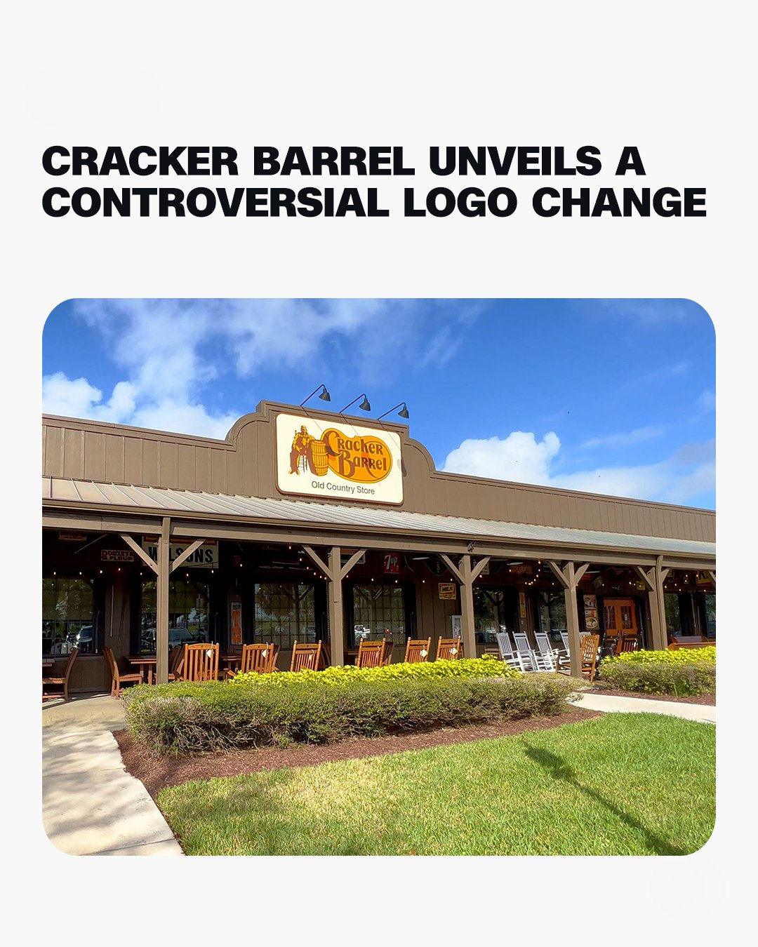
The biggest change: Cracker Barrel has dropped the image of the barrel and the man sitting beside it from its logo, elements that have been central to its branding since 1977. Instead, the new logo is described as being “rooted even more closely to the iconic barrel shape,” though ironically the barrel itself is no longer present. In a blog post, the company explained that barrels once served as gathering spots in general stores, “essentially the water coolers of the day,” making the symbol a nod to its rustic origins. But despite that history, the company has chosen to move in a different direction. The response on Wall Street was swift.
Shares of Cracker Barrel Holdings (CBRL) plunged more than 12% in trading Thursday, reflecting investor concerns that the rebrand might alienate loyal customers without successfully attracting enough new diners to offset the risk. The new logo rollout is part of a larger effort that includes updated TV commercials, a redesigned menu with new fall-themed dishes, and refreshed restaurant interiors. CEO Julie Felss Masino, who has been leading the transformation since 2024, has been clear about the company’s mission.
“The way we communicate, the things on the menu, the way the stores look and feel … all of these things came up time and time again in our research as opportunities for us to really regain relevancy,” she explained, emphasizing that the brand needs to evolve to stay competitive in today’s casual dining market. The company has already begun remodeling some of its 660-plus locations across the country. The redesigns have stripped away many of the cluttered, country-themed trinkets and antiques that once lined the walls, replacing them with lighter interiors and a more modern feel. For some diners, the cleaner look is a welcome update, but others have voiced frustration, particularly on social media.
TikTok videos criticizing the changes have gone viral, with nostalgic customers lamenting the loss of the old-fashioned, cozy aesthetic that made Cracker Barrel unique. On X, formerly known as Twitter, one user complained that “changing the logo just feels like another little piece of culture dying off,” while some conservative figures, including former President Donald Trump’s son, also publicly criticized the new branding. The strong reactions highlight the tension between modernization and tradition. For Cracker Barrel, a chain that has carefully cultivated its image of rustic simplicity and Southern charm since its founding in 1969, any significant change risks alienating the core base of loyal customers who view the brand as more than just a restaurant but as a symbol of Americana.
Marketing experts have weighed in on the risks. Anjali Bal, an associate professor of marketing at Babson College, told CNN that the rebrand could backfire if not managed carefully. “This risk is amplified if the company misjudges the market or fails to communicate the change effectively,” she said. “In Cracker Barrel’s case, they’ve retained their color palette but altered their iconic logo, which is likely to face resistance simply because of how recognizable it is. That could spark curiosity among new customers, but it may also upset long-time patrons.”
Bal also warned that the updated logo could cause the brand to “stand out less and risk diluting its uniqueness,” while stressing that the real challenge will be ensuring that modernization doesn’t come at the expense of brand recognition or emotional connection. Despite the backlash, Masino insists the changes are resonating with many diners. She told ABC News this week that customer feedback has been “overwhelmingly positive” and that people “like what we’re doing.” The company’s belief is that creating a more modern and inviting atmosphere, paired with an updated menu, will help broaden its appeal, especially among younger generations who may not feel the same nostalgia for the chain’s country store-style decor.
Financially, Cracker Barrel has been navigating a challenging landscape. In June, the company reported an unusual hit to earnings: a $5 million loss tied to tariffs on its retail merchandise, much of which is imported from overseas. Still, restaurant revenue and same-store sales showed slight growth, reflecting broader trends in the casual dining sector where other chains are also experiencing modest gains. The stakes are high for Cracker Barrel as it attempts to balance its storied heritage with a forward-looking identity. On one hand, the chain wants to avoid being seen as outdated or irrelevant in a competitive dining industry dominated by trendier concepts.
On the other, it risks alienating customers who have long cherished its nostalgic, homey atmosphere. Whether the new logo and redesign will ultimately help or hurt the brand remains to be seen, but one thing is certain: for a company so deeply tied to tradition, change is proving to be as risky as it is necessary.